


At Studio Dean we’ve been using tones of brown forever. We love it. If we had a flag to wave, it would be brown. We’ve even designed a new collection of wallpapers, all with brown undertones called EVOLVED. Here’s our love letter to the warm, welcoming beauty of brown and how your readers can tap into this autumn’s interior design colour of choice with timeless results.
Founder and CEO of Studio Dean, Cathy Dean says:
“A brown interior colour scheme is surprisingly versatile and not at all as dramatic as it sounds, as there are so many tones that you can ease into. Opting for a neutral brown base allows you to have versatility in your home as you can easily bring in other colours and trends. Add in a green for an earthy, nature inspired feeling, opt for a pink for a soft feminine space or a navy if you want something a little more bold. These tiny switch-outs alongside a base in a solid neutral mean you are not getting tired of your room and deciding to redecorate far more often than you need to!”
IS BROWN FOR YOU?
“Firstly, take a look in your wardrobe, open the doors and step back to see what’s in there. Is it a plethora of rainbow colours? Monotone? Are there patterns all over the place, or is it a tonal variation on one colour theme? Although interiors and fashion differ, this will give you a good indication of your natural ‘happy pallette’. If, following this exercise you’ve found your fashion choices do indeed include browns, caramels, taupes, beiges, creams etc…. then this colour choice is for you. It will feel delicious!”
“Brown is in nature as the base, the bark of the tree, the soil to the grass. When thinking about a scheme you need to give it depth, never more true with brown which is not at its strongest on its own, it needs variation as you see in nature too. A tree’s bark is not just one brown,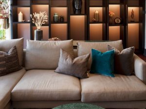 it has many shades and textures, so when working with brown use lots of shades and textures to look natural. Pick a palette of tones of brown, you’ll need four or five shades going from light to dark.
Think about the floor, sofa, worktops etc. Keep the main features neutral and scatter the deeper tones into the mix. Paint the walls taupe, greige, or even cream if the others still feel too dark for you, bring in brown furniture, add wood, cushions, linen curtains in a taupe tone – all of these elements layer together so well. Try to get small samples of each of these things and place them all together before you hit the shops and get going. It will pay dividends to know where you are going and how much brown you can handle before you start.”
WHAT COLOURS GO WITH BROWN?
“Don’t go too stark and try to contrast with brown. Take things slowly and layer up and down through the palette you have selected, it is a colour that likes to be understated and simple. Hold all of the colours together and make sure it has the same undertone.
Mother nature is the queen of colour, and brown and green could not be a better match. A little more controversial and less obvious is a brown and black combination, we love it! I love to bring in drama to a room, light and dark combining together to give the space depth is something we bring to all projects. Feel free to try it, pick a brown undertoned black like Benjamin Moore Black Beauty for the walls and then choose a tan leather chair to sit in front of it, it’s the perfect backdrop!
One close to my heart is a touch of pink. Make sure the pink you select is dirty, muddy pink. Benjamin Moore’s Muddy York is a fab example of the tone you need to be brown’s new best friend. Again, think outside of it being a wall colour, select the pink just as a throw, an object (think oversized battered stoneware with a matt pink distressed finish), or perhaps just use those tones in artwork in the room.
BEST BROWNS FOR INTERIOR DESIGN
“Some browns are very red or green; you may like the particularly dark or light version of it but as you go up and down the tone it’s not exactly what you had in mind. If this is the case, ditch it and opt for a colour where you love the whole palette.
In our experience, a brown sitting in the stony grey / greige palette offers the most versatility and sits well with a neutral base. One of our favourites in the studio is Deep Caviar by Benjamin Moore, it actually has a rich, purple undertone, and moves through the colour range palette well into stone tones. 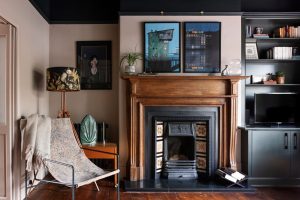 Benjamin Moore’s Black Beauty is a black with a brown undertone, and you can use this colour to add some serious drama. This colour is most definitely a statement, here’s some tips on its colour friends so you can see how you dial it up or down – Benjamin Moore’s Alexandria Beige, Innukshuk and Pale Oak are some of our more recent go-to colours as you you can go up and down in the same palette, without the colour becoming cream (or heaven forbid magnolia!), instead with this colour family the tones stay stony.”
“Another great way to select a palette is to bring in a wallpaper with multiple tones in it. Pulling out the light and dark elements of the paper and bringing a paper into your scheme works wonderfully to add in much needed texture. We’ve actually been busy over at The Studio Dean Edit and given our love for this colour family, we have created some beautiful wallpapers all in our favourite brown base.
A few examples of gorgeous brown wallpaper to take a look at: Our fabric effect Hali and Kairi papers in Mushroom have gorgeous warm undertones and add texture without pattern. Or, if you are braver, our brown undertoned black wallpapers in Bracken are great friends with brown, Asteria in Bracken is a black and brown interior design masterclass.”
From £120 a roll at www.studiodeanedit.com/shop/wallpaper.
Manufacturing & Engineering Magazine | The Home of Manufacturing Industry News